

MARKETING DESIGN
BRAND APPLICATIONS
PRINT & DIGITAL ASSETS
RETAIL COMMUNICATION
CATEGORY
THE PROJECT
THE NAME
SOHO
PROFESSIONAL EXPERIENCE
During my time at SOHO, I worked on a wide range of visual communication and marketing design projects, translating
the brand’s identity into campaigns and applications across digital, print, packaging, and retail environments.
My work combined concept development, visual storytelling, design, and production, with each project tailored to its specific objective, audience, and format. Across every touchpoint, I focused on maintaining a consistent visual language while strengthening SOHO’s distinctive
brand presence.
PROFESSIONAL EXPERIENCE
THE NAME
SOHO
MARKETING DESIGN
BRAND APPLICATIONS
PRINT & DIGITAL ASSETS
RETAIL COMMUNICATION
CATEGORY
THE PROJECT
COURSE
During my time at SOHO, I worked on a wide range of visual communication and marketing design projects, translating the brand’s identity into campaigns and applications across digital, print, packaging, and retail environments. My work combined concept development, visual storytelling, design, and production, with each project tailored to its specific objective, audience, and format. Across every touchpoint,
I focused on maintaining a consistent
visual language while strengthening SOHO’s distinctive brand presence.


BRAND APPLICATIONS
Each application was developed in line with SOHO’s visual language, adapting to different needs and formats. Together, they form a consistent visual system that strengthens the brand identity across multiple touchpoints.
SOHO

( 01 )
Exhibition Billboard

( 02 )
Poster

( 03 )
Employee Email Signature System

( 04 )
Holiday Greeting Card

( 05 )
Juice Cup TA
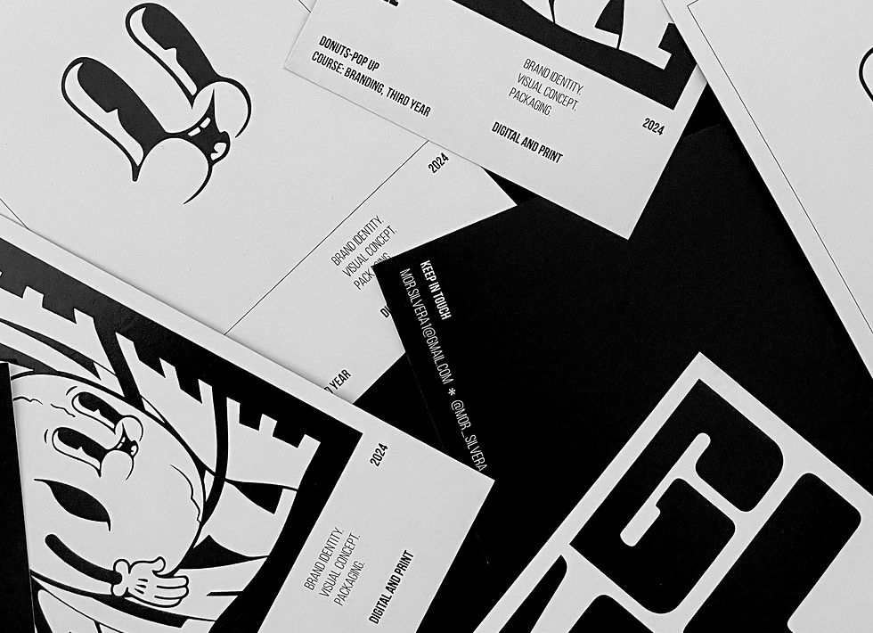
( 06 )
Postcards
The choice of color stems from
the desire to convey the flavorful
experience without relying on
additional colors.
THE COLOR
THE COLOR
The choice of color stems from
the desire to convey the flavorful experience without relying on
additional colors.
THE CHALLENGE
SOHO brings together a wide range of brands, each with its own visual language, audience, and character. The challenge was to preserve the identity and uniqueness of each brand while adapting it to SOHO’s visual language and the commercial needs of each project.
Each project began with an understanding
of the brand and product, alongside the key message and objective. From there, I developed
a visual direction through imagery, typography, color, composition, and hierarchy, and then adapted it across different formats and touchpoints.


SOHO brings together a wide range
of brands, each with its own visual language, audience, and character.
The challenge was to preserve the identity and uniqueness of each brand while adapting it to SOHO’s visual language and the commercial needs
of each project.
Each project began with an understanding of the brand and product, alongside the key message and objective. From there, I developed
a visual direction through imagery, typography, color, composition, and hierarchy, and then adapted it across different formats and touchpoints.
THE CHALLENGE
The choice of color stems from
the desire to convey the flavorful
experience without relying on
additional colors.
THE COLOR
SOHO
Each application was developed in line with SOHO’s visual language, adapting to different needs and formats. Together,
they form a consistent visual system that strengthens the brand identity across multiple touchpoints.
BRAND APPLICATIONS

( 01 )
Exhibition Billboard
MERCH
Each item embodies the brand identity, a blend of graphic
rigidity and youthful, free energy. Together, the items form
a cohesive visual system that connects the brand’s design
world with the world of experience.
GLAZE

( 02 )
Poster
MERCH
Each item embodies the brand identity, a blend of graphic
rigidity and youthful, free energy. Together, the items form
a cohesive visual system that connects the brand’s design
world with the world of experience.
GLAZE

( 03 )
Employee Email Signature System
MERCH
Each item embodies the brand identity, a blend of graphic
rigidity and youthful, free energy. Together, the items form
a cohesive visual system that connects the brand’s design
world with the world of experience.
GLAZE

( 04 )
Holiday Greeting Card
MERCH
Each item embodies the brand identity, a blend of graphic
rigidity and youthful, free energy. Together, the items form
a cohesive visual system that connects the brand’s design
world with the world of experience.
GLAZE

( 05 )
Juice Cup TA
MERCH
Each item embodies the brand identity, a blend of graphic
rigidity and youthful, free energy. Together, the items form
a cohesive visual system that connects the brand’s design
world with the world of experience.
GLAZE

( 06 )
Postcards
MERCH
Each item embodies the brand identity, a blend of graphic
rigidity and youthful, free energy. Together, the items form
a cohesive visual system that connects the brand’s design
world with the world of experience.
GLAZE
( 01 )
3 pcs Donut Box
MERCH
Each item embodies the brand identity, a blend of graphic
rigidity and youthful, free energy. Together, the items form
a cohesive visual system that connects the brand’s design
world with the world of experience.
GLAZE


The choice of color stems from
the desire to convey the flavorful experience without relying on
additional colors.
THE COLOR

