


RISO PRINT
ART DIRECTION
WRITING
CATEGORY
THE PROJECT
THE NAME
TYLER MITCHELL
RISO
COURSE
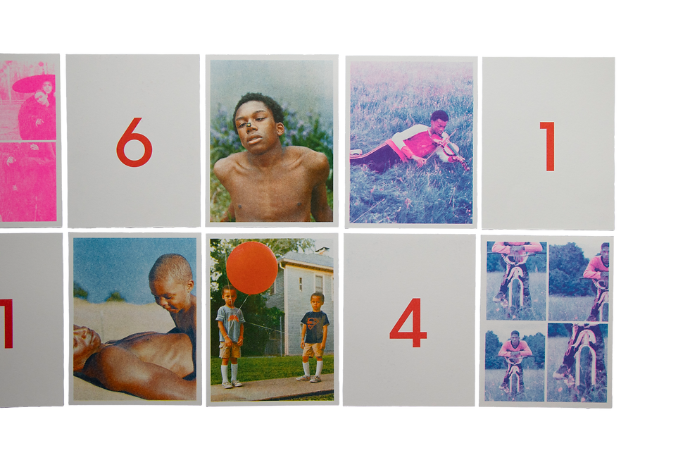
Tyler Mitchell is a visual homage to the groundbreaking photographer who reshaped contemporary fashion
imagery. The project reinterprets Mitchell’s iconic photographs through
a designed system of postcards and a foldable poster, combining both visual and textual perspectives. The interplay
of risograph-inspired colors and clean typography emphasizes the meeting point between photography and design, highlighting the way Mitchell redefined the representation of Black identity in fashion and art.


TYLER MITCHELL
The postcards translate Mitchell’s photographic language
into a tactile experience through layers of color and
risograph texture.
POSTCARDS

( 01 )
Wales Bonner x Adidas Originals FW21
MERCH
Each item embodies the brand identity, a blend of graphic
rigidity and youthful, free energy. Together, the items form
a cohesive visual system that connects the brand’s design
world with the world of experience.
GLAZE

( 02 )
Wales Bonner x Adidas Originals FW21
MERCH
Each item embodies the brand identity, a blend of graphic
rigidity and youthful, free energy. Together, the items form
a cohesive visual system that connects the brand’s design
world with the world of experience.
GLAZE
( 03 )
Wales Bonner x Adidas Originals FW21
MERCH
Each item embodies the brand identity, a blend of graphic
rigidity and youthful, free energy. Together, the items form
a cohesive visual system that connects the brand’s design
world with the world of experience.
GLAZE

( 04 )
Wales Bonner x Adidas Originals FW21
MERCH
Each item embodies the brand identity, a blend of graphic
rigidity and youthful, free energy. Together, the items form
a cohesive visual system that connects the brand’s design
world with the world of experience.
GLAZE
( 05 )
Chrysalis - Exhibition View
MERCH
Each item embodies the brand identity, a blend of graphic
rigidity and youthful, free energy. Together, the items form
a cohesive visual system that connects the brand’s design
world with the world of experience.
GLAZE
( 06 )
Dreaming in Real Time
MERCH
Each item embodies the brand identity, a blend of graphic
rigidity and youthful, free energy. Together, the items form
a cohesive visual system that connects the brand’s design
world with the world of experience.
GLAZE

( 07 )
Dreaming in Real Time
MERCH
Each item embodies the brand identity, a blend of graphic
rigidity and youthful, free energy. Together, the items form
a cohesive visual system that connects the brand’s design
world with the world of experience.
GLAZE

( 08 )
Dreaming in Real Time
MERCH
Each item embodies the brand identity, a blend of graphic
rigidity and youthful, free energy. Together, the items form
a cohesive visual system that connects the brand’s design
world with the world of experience.
GLAZE

( 09 )
M le Monde SS23
MERCH
Each item embodies the brand identity, a blend of graphic
rigidity and youthful, free energy. Together, the items form
a cohesive visual system that connects the brand’s design
world with the world of experience.
GLAZE

( 10 )
Hair -i-D Magazine 2019
MERCH
Each item embodies the brand identity, a blend of graphic
rigidity and youthful, free energy. Together, the items form
a cohesive visual system that connects the brand’s design
world with the world of experience.
GLAZE
( 11 )
Mona Tougaard - i-D Magazine
MERCH
Each item embodies the brand identity, a blend of graphic
rigidity and youthful, free energy. Together, the items form
a cohesive visual system that connects the brand’s design
world with the world of experience.
GLAZE

( 12 )
Beyoncé -Vogue US - 2018
MERCH
Each item embodies the brand identity, a blend of graphic
rigidity and youthful, free energy. Together, the items form
a cohesive visual system that connects the brand’s design
world with the world of experience.
GLAZE


BRAND IDENTITY.
PACKAGING.
CATEGORY
THE PROJECT
THE NAME
GLAZE
BRANDING
COURSE
Meet Glaze, a temporary pop-up donut brand developed in a third-year branding course. The project draws inspiration from Kanye West’s multifaceted persona and his experience with bipolar disorder. This duality is translated into a visual language: bold and rigid typography contrasted with a light and sweet illustrated donut character. The choice
to present the project entirely in black and white creates a powerful, surprising, and unforgettable experience. The visual identity I designed unfolds across different formats, each reflecting the brand’s unique essence.
RISO
THE NAME
TYLER MITCHELL
RISO PRINT
ART DIRECTION
WRITING
CATEGORY
THE PROJECT
COURSE
Tyler Mitchell is a visual homage to the groundbreaking photographer who reshaped contemporary fashion imagery. The project reinterprets Mitchell’s iconic photographs through a designed system
of postcards and a foldable poster, combining both visual and textual perspectives. The interplay of risograph-inspired colors and clean typography emphasizes the meeting point between photography and design, highlighting the way Mitchell redefined the representation of Black identity in fashion and art.


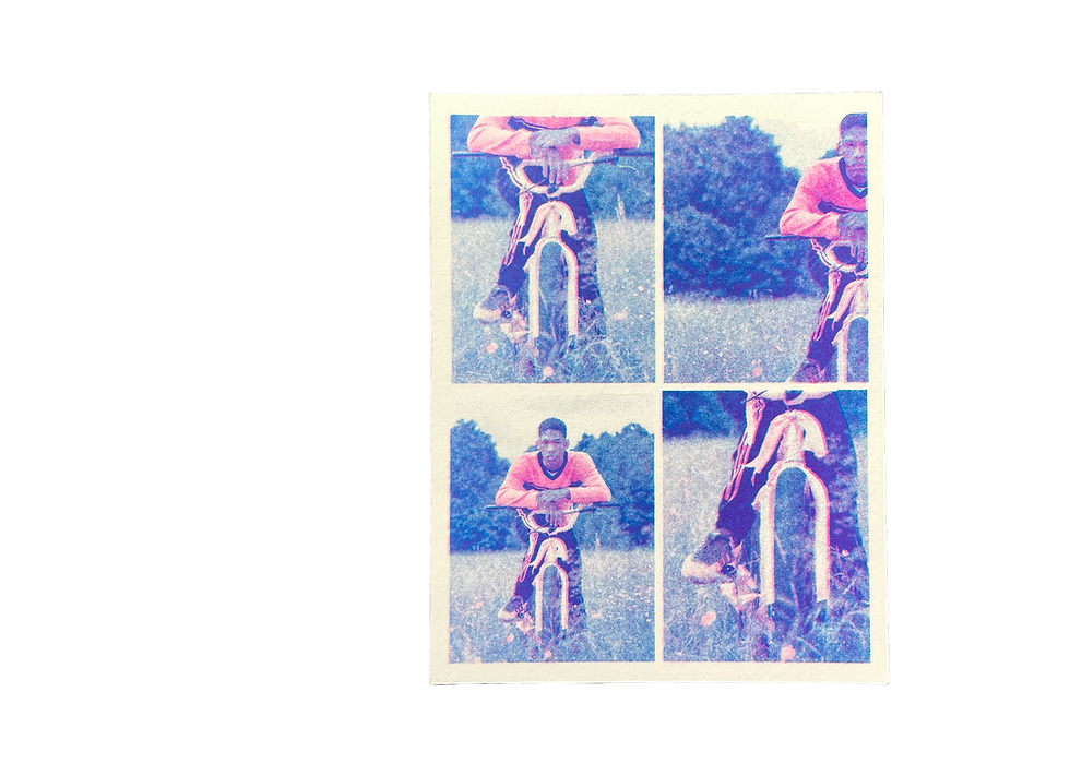
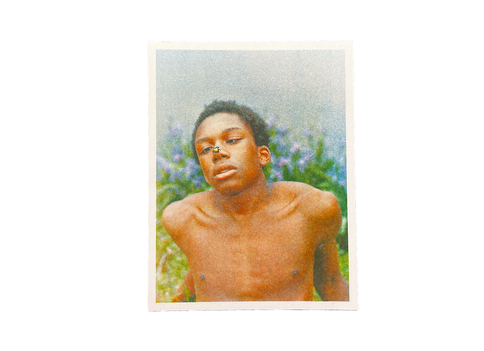
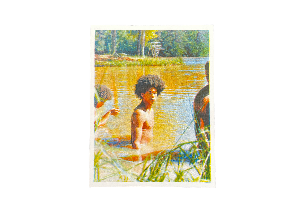
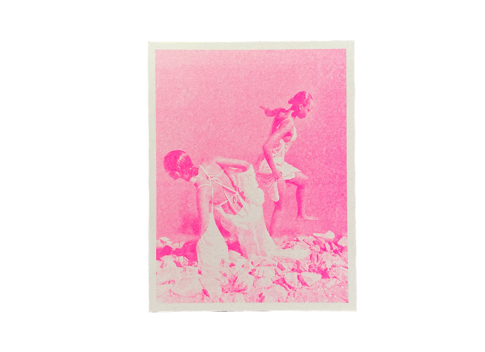
POSTCARDS
The postcards translate Mitchell’s photographic language into a tactile experience through layers of color and
risograph texture.
TYLER MITCHELL

( 01 )
Wales Bonner x Adidas Originals FW21
( 02 )
Wales Bonner x Adidas Originals FW21
( 03 )
Wales Bonner x Adidas Originals FW21
( 04 )
Wales Bonner x Adidas Originals FW21

( 05 )
Chrysalis - Exhibition View
( 06 )
Dreaming in Real Time
( 07 )
Dreaming in Real Time
( 08 )
Dreaming in Real Time
( 09 )
M le Monde SS23
( 10 )
Hair -i-D Magazine 2019
( 11 )
Mona Tougaard -i-D Magazine
( 12 )
Beyoncé - Vogue US - 2018


THE FORMAT
The choice to combine a foldable poster with a system of postcards emphasizes the dialogue between the personal and the public, creating
a complementary interface in which the postcard leads to the poster.
This generates a continuous experience: from an intimate view
of the detail to a broader reading
of the whole context.


The choice to combine a foldable poster with a system of postcards emphasizes the dialogue between the personal and the public, creating a complementary interface in which the postcard leads to the poster.
This generates a continuous experience: from an intimate view
of the detail to a broader reading of the whole context.
THE FORMAT