


EDITORIAL DESIGN
ART DIRECTION
WRITING
CATEGORY
THE PROJECT
THE NAME
YOU ARE NOT GOING TO DIE
FORMATS
COURSE
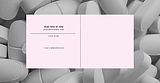
You Are Not Going to Die is a medication Guide for hypochondriacs, born out of
a personal tendency toward mild health anxiety. The project aimed to transform complex medical information into something accessible, readable, and organized - unlike the convoluted drug leaflets we are all familiar with. The book categorizes medications according to the body systems they affect, with each system represented by an abstract and unique visual. The graphic language is defined by a clear grid, precise typography, and symbolic colors
that deepen the narrative.
YOU ARE NOT GOING TO DIE
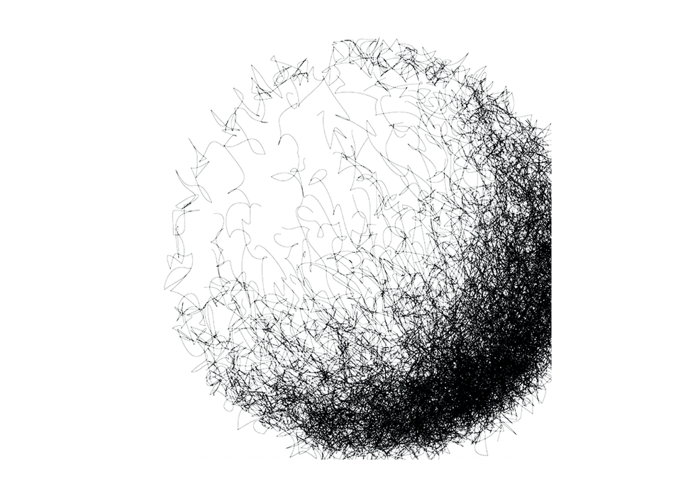
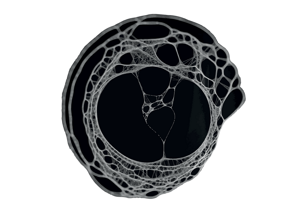
The graphic visuals were created using a precise
monochromatic language based on line, layer, and
texture. Each visual is designed according to the
name of the system and reflects its unique character.
GRAPHIC VISUALS

( 01 )
מערכת העיכול
MERCH
Each item embodies the brand identity, a blend of graphic
rigidity and youthful, free energy. Together, the items form
a cohesive visual system that connects the brand’s design
world with the world of experience.
GLAZE

( 02 )
מערכת העצבים
MERCH
Each item embodies the brand identity, a blend of graphic
rigidity and youthful, free energy. Together, the items form
a cohesive visual system that connects the brand’s design
world with the world of experience.
GLAZE

( 03 )
עיניים
MERCH
Each item embodies the brand identity, a blend of graphic
rigidity and youthful, free energy. Together, the items form
a cohesive visual system that connects the brand’s design
world with the world of experience.
GLAZE

( 04 )
מערכת השתן
MERCH
Each item embodies the brand identity, a blend of graphic
rigidity and youthful, free energy. Together, the items form
a cohesive visual system that connects the brand’s design
world with the world of experience.
GLAZE

( 05 )
מערכת הלב
MERCH
Each item embodies the brand identity, a blend of graphic
rigidity and youthful, free energy. Together, the items form
a cohesive visual system that connects the brand’s design
world with the world of experience.
GLAZE

( 06 )
מערכת הנשימה
MERCH
Each item embodies the brand identity, a blend of graphic
rigidity and youthful, free energy. Together, the items form
a cohesive visual system that connects the brand’s design
world with the world of experience.
GLAZE

( 07 )
מערכת הדם
MERCH
Each item embodies the brand identity, a blend of graphic
rigidity and youthful, free energy. Together, the items form
a cohesive visual system that connects the brand’s design
world with the world of experience.
GLAZE

( 08 )
מערכת הרבייה
MERCH
Each item embodies the brand identity, a blend of graphic
rigidity and youthful, free energy. Together, the items form
a cohesive visual system that connects the brand’s design
world with the world of experience.
GLAZE


BRAND IDENTITY.
PACKAGING.
CATEGORY
THE PROJECT
THE NAME
GLAZE
BRANDING
COURSE
Meet Glaze, a temporary pop-up donut brand developed in a third-year branding course. The project draws inspiration from Kanye West’s multifaceted persona and his experience with bipolar disorder. This duality is translated into a visual language: bold and rigid typography contrasted with a light and sweet illustrated donut character. The choice
to present the project entirely in black and white creates a powerful, surprising, and unforgettable experience. The visual identity I designed unfolds across different formats, each reflecting the brand’s unique essence.
FORMATS
THE NAME
YOU ARE NOT GOING TO DIE
EDITORIAL DESIGN
ART DIRECTION
WRITING
CATEGORY
THE PROJECT
COURSE
You Are Not Going to Die is a medication
Guide for hypochondriacs, born out of a personal tendency toward mild health anxiety. The project aimed to transform complex medical information into something accessible, readable, and organized - unlike the convoluted drug leaflets we are all familiar with.
The book categorizes medications according to the body systems they
affect, with each system represented by
an abstract and unique visual. The graphic language is defined by a clear grid, precise
typography, and symbolic colors that deepen the narrative.


GRAPHIC VISUALS
The graphic visuals were created using a precise monochromatic language based on line, layer, and
texture. Each visual is designed according to the
name of the system and reflects its unique character.
YOU ARE NOT GOING TO DIE

( 01 )
מערכת העיכול
( 02 )
מערכת העצבי�ם

( 03 )
עיניים


( 04 )
מערכת השתן

( 05 )
מערכת הלב
( 06 )
מערכת הנשימה

( 07 )
מערכת הדם

( 08 )
מערכת הרבייה
The use of colors drawn from the human body reflects its medical context and sets the foundation for the book's
visual identity.
THE COLOR
THE COLOR
The use of colors drawn from the human body reflects its medical context and sets the foundation for the book’s visual identity.
The use of colors drawn from the human body reflects its medical context and sets the foundation for the book’s
visual identity.
THE COLOR

