BRAND IDENTITY
PACKAGING
CATEGORY
THE PROJECT
THE NAME
GLAZE
BRANDING
COURSE
Meet Glaze, a temporary pop-up donut brand developed in a third-year branding course. The project draws inspiration from Kanye West’s multifaceted persona and his experience with bipolar disorder. This duality is translated into a visual language: bold and rigid typography contrasted with a light and sweet illustrated donut character. The choice
to present the project entirely in black and white creates a powerful, surprising, and unforgettable experience. The visual identity I designed unfolds across different formats, each reflecting the brand’s unique essence.
BRANDING
THE NAME
GLAZE
BRAND IDENTITY
PACKAGING
CATEGORY
THE PROJECT
COURSE
Meet Glaze, a temporary pop-up donut brand developed in a third-year branding course. The project draws inspiration from Kanye West’s multifaceted persona and
his experience with bipolar disorder.
This duality is translated into a visual language: bold and rigid typography contrasted with a light and sweet illustrated donut character. The choice to present the project entirely in black and white creates
a powerful, surprising, and unforgettable experience. The visual identity I designed unfolds across different formats, each reflecting the brand’s unique essence.


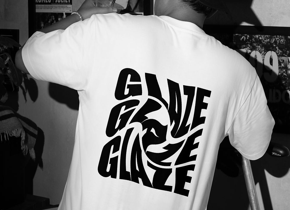
MERCH
Each item embodies the brand identity, a blend of graphic rigidity and youthful, free energy. Together, the items form
a cohesive visual system that connects the brand’s design world with the world of experience.
GLAZE

( 01 )
3 pcs Donut Box

( 02 )
Hot Cup TA

( 03 )
T-Shirt

( 04 )
Single Donut Box

( 05 )
Juice Cup TA

( 06 )
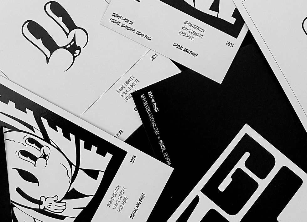
Postcards
The choice of color stems from
the desire to convey the flavorful
experience without relying on
additional colors.
THE COLOR

THE LOGO
The logo features soft, rounded typography that conveys the
roundness and tastefulness of
the donut.

THE COLOR
The choice of color stems from
the desire to convey the flavorful experience without relying on
additional colors.

The logo features soft, rounded
typography that conveys the
roundness and tastefulness of
the donut.
THE LOGO
The choice of color stems from
the desire to convey the flavorful
experience without relying on
additional colors.
THE COLOR
GLAZE
Each item embodies the brand identity, a blend of graphic
rigidity and youthful, free energy. Together, the items form
a cohesive visual system that connects the brand’s design
world with the world of experience.
MERCH

( 01 )
3 pcs Donut Box
MERCH
Each item embodies the brand identity, a blend of graphic
rigidity and youthful, free energy. Together, the items form
a cohesive visual system that connects the brand’s design
world with the world of experience.
GLAZE

( 02 )
Hot Cup TA
MERCH
Each item embodies the brand identity, a blend of graphic
rigidity and youthful, free energy. Together, the items form
a cohesive visual system that connects the brand’s design
world with the world of experience.
GLAZE

( 03 )
T-shirt
MERCH
Each item embodies the brand identity, a blend of graphic
rigidity and youthful, free energy. Together, the items form
a cohesive visual system that connects the brand’s design
world with the world of experience.
GLAZE

( 04 )
Single Donut Box
MERCH
Each item embodies the brand identity, a blend of graphic
rigidity and youthful, free energy. Together, the items form
a cohesive visual system that connects the brand’s design
world with the world of experience.
GLAZE

( 05 )
Juice Cup TA
MERCH
Each item embodies the brand identity, a blend of graphic
rigidity and youthful, free energy. Together, the items form
a cohesive visual system that connects the brand’s design
world with the world of experience.
GLAZE

( 06 )
Postcards
MERCH
Each item embodies the brand identity, a blend of graphic
rigidity and youthful, free energy. Together, the items form
a cohesive visual system that connects the brand’s design
world with the world of experience.
GLAZE
( 01 )
3 pcs Donut Box
MERCH
Each item embodies the brand identity, a blend of graphic
rigidity and youthful, free energy. Together, the items form
a cohesive visual system that connects the brand’s design
world with the world of experience.
GLAZE


The choice of color stems from
the desire to convey the flavorful experience without relying on
additional colors.
THE COLOR


